A closer look at product filters, more flexible product pages and a simpler add-to-cart experience
Beautiful products deserve a shop that makes them easy to find and gives customers a reason to choose them.
Squarespace has added some useful features to its 7.1 online shops. They give you more ways to help customers browse, share what makes a product special and make that next step towards buying a little easier.
Here are the changes I’m most pleased to see.
1. Product filters are finally here. Hooray!
If your shop has lots of products, finding the right one can take a bit of scrolling. Product filters give customers a quicker way to narrow down what they’re looking for.
You can create filters using tags assigned to your products. For example, a fashion or homeware brand could use tags such as:
Colour: red, blue, yellow
Style: hat, glove, scarf
Collection: winter 2026, spring edit
material: cashmere, wool, merino
Product name: a particular design or range
This is especially useful if you have a large collection. A customer searching for their favourite colour (navy in my case!) can filter the shop to find relevant products instead of scrolling through everything.
A small thing to be aware of: filters work with product tags. If you offer colours as variants within one product, the colours aren’t separate products for the filter to show. But if each colourway has its own product listing, you can tag and filter those listings accordingly.
It’s a long-overdue addition, and one that can make browsing feel more personal and less like searching through a rail with your eyes closed.
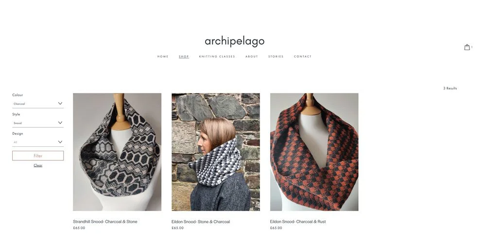
New filter feature added to Archipelago store page.
2. Product pages can tell a much fuller story
Until now, product pages have felt quite limited. You could add the key information like images, description, price and varient options, but there wasn’t any functionality available to build out the story around the product.
Now, you can add sections below the main product information, using the same sort of content blocks you’d use on other pages.
That means you could include:
A customer testimonial or product review
Photos showing the product being made
A short video about your materials or production process
More detail about fit (or even a size guide download), feel, care or where the product comes from
An embedded Google review feed, if that’s where you collect reviews
For a considered purchase, customers often want to know more than what a product looks like. How was it made? What materials were used? Why does it cost what it costs? Does it suit their needs?
A well-built product page gives you space to answer those questions, show the care behind your work and back up your claims with customer feedback. It can help someone understand the value of a product before it arrives in the letterbox.
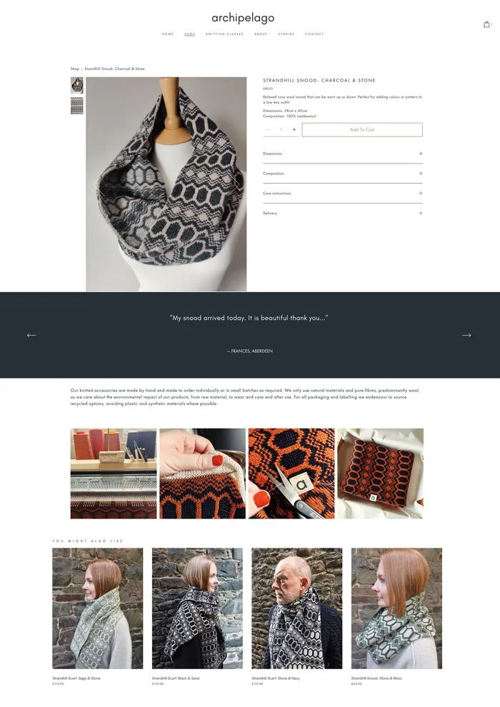
New product page layout for Archipelago knitwear, featuring customer reviews and process pictures.
3. Adding to the basket feels easier
There’s also a small but welcome improvement after someone adds a product to their basket.
A mini cart confirmation appears, giving them the option to head to checkout or continue shopping. They don’t have to scroll back up to the navigation and find the basket icon themselves.
It’s a simple change, but it makes the next step clearer. Customers can carry on browsing, or go straight to checkout if they’re ready.
What I’d still love to see
There are a few shop features still on my wish list, that would make a Squarespace store more comparable with shopify:
I’d love to see colour variants displayed as colour chips. At the moment, variants can appear as buttons or in a dropdown, but little colour swatches would make it much easier to see the options at a glance, particularly for colour-led brands.
I’d also like Squarespace to bring back the option to move straight to the next or previous product while browsing. This was available in Squarespace 7.0, but it’s missing in 7.1. I’ve added a plugin to the Collingwood-Norris website to make it possible there, but it would be much better to have this as a built-in feature.
And a built-in favourites or wishlist feature would be useful too. Not everyone is ready to buy on their first visit. Sometimes they just want to save a product and come back to it later.
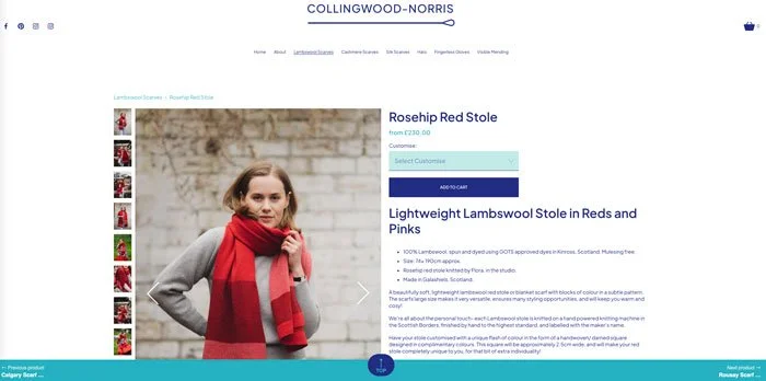
Next and previous product page navigation added to Collingwood-Norris Website