HAY
+brand identity design
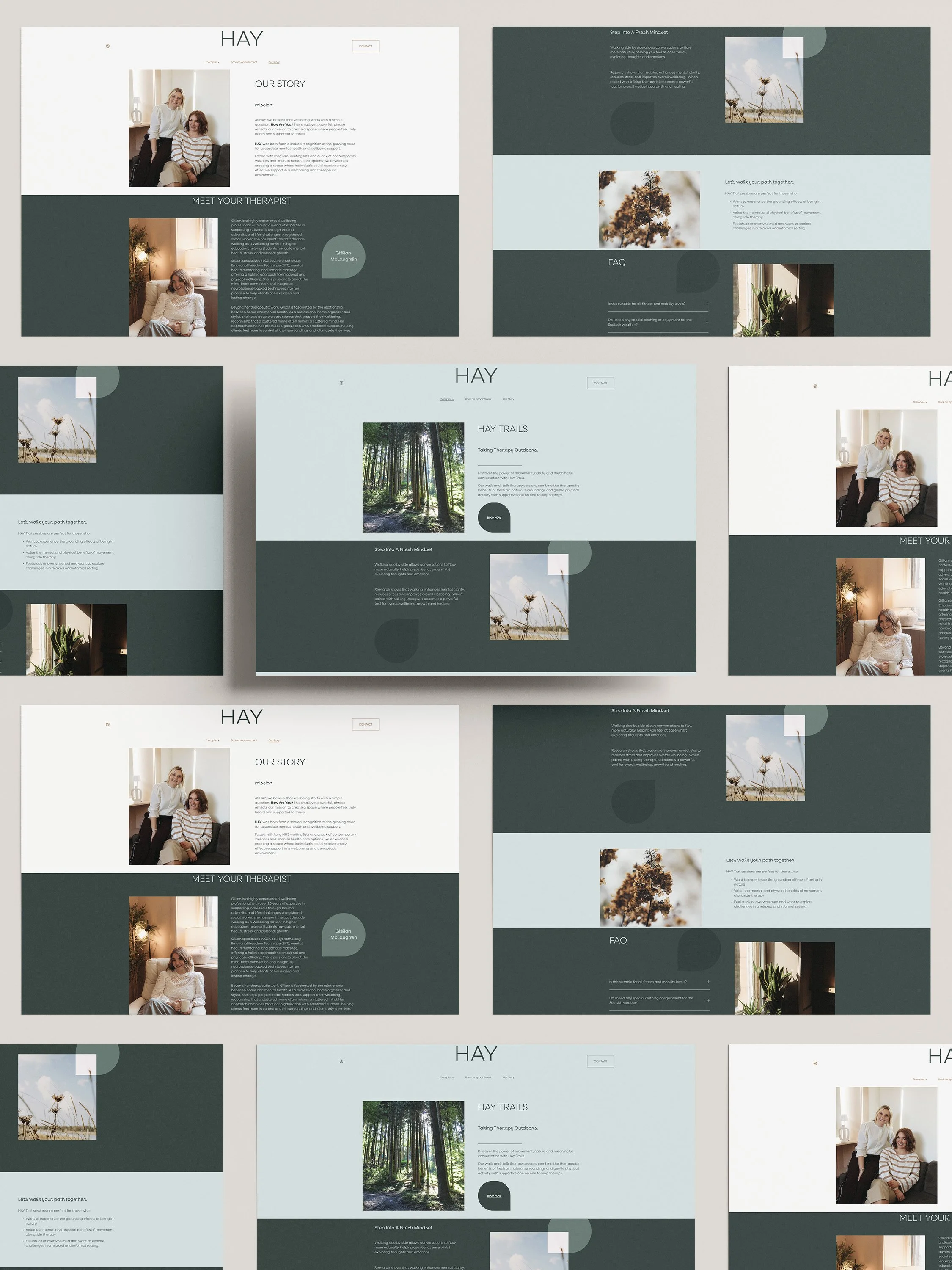
+squarespace website
the brief: to craft a visual identity that feels calm, contemporary and welcoming- just like the support HAY provides to its clients.
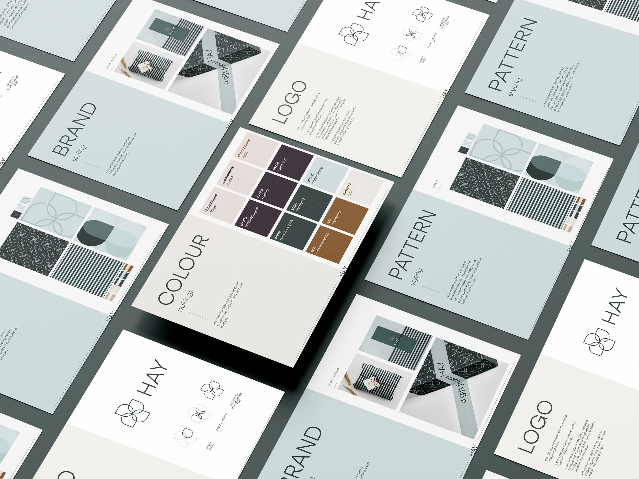
A strong brand identity isn’t just about a beautiful logo, it’s about creating a consistent concept across every touchpoint.
The solution:
Main logo with variations and submark for flexibility across different platforms.
Soothing colour palette to reflect the brands warmth and trustworthiness.
Typography system that is both professional and approachable.
Brand patterns, those subtle design details and elements that add depth and difference to social media posts, website backgrounds and business stationery.
Branded stationery, signage & Packaging ensuring every interaction with HAY feels cohesive and is memorable.
Why does all this matter? Because launching a business across multiple platforms requires brand consistency. From social media to business cards, every piece of your brand should tell the same story and create a lasting impression.
“We are literally obsessed Amy. The way you’ve captured the essence of our business through colour, pattern and overall vibe is more than we could ever have imagined. You’re so talented! ”